








gori ships thirty-two built-in colour themes: goridark (the default), goriday, dancheong, hanji, latte, espresso, tokyonight, gruvbox, nord, dracula, solarized_light, rosepine_dawn, catppuccin_mocha, monokai, everforest, onedark, kanagawa, github_dark, zenburn, synthwave84, cyberpunk, matrix, cobalt2, high_contrast, github_light, gruvbox_light, one_light, ayu_light, rosepine, tokyonight_day, solarized_dark, and everforest_light.
Switching Themes
Open Preferences with Ctrl-, (or the ⚙ chip in the top bar), go to Appearance, and press ↵ on the Theme row. The row previews the current theme inline: its name and a small swatch of its palette. Ctrl-P → Settings: Theme opens the same picker in one step.
The picker is a vertical, scrollable list; each row shows a small swatch of the theme's own palette, and selecting a row previews it live. Enter applies and persists the choice, Esc reverts.
Ctrl-, works in the project picker too, so you can set your theme on first launch before opening a project. Every form section is editable there, and Theme is the one opener that works; the other openers (Tabs, Env, Hotkeys, the Keyset playground, hostname overrides, and User-Agents) need a project open.
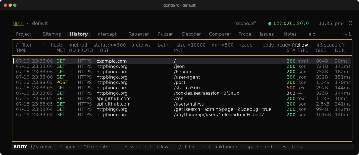
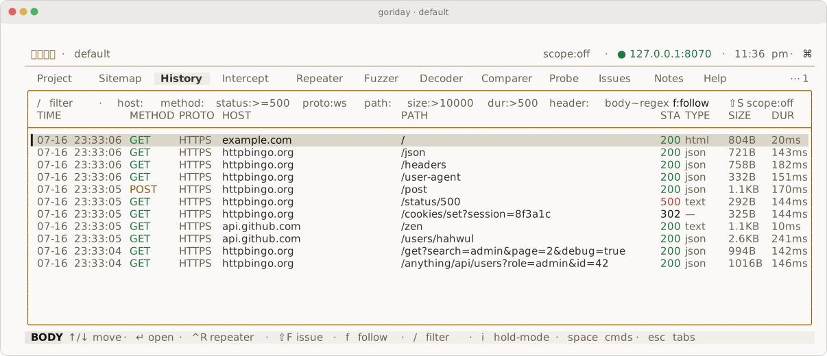
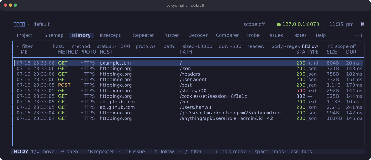
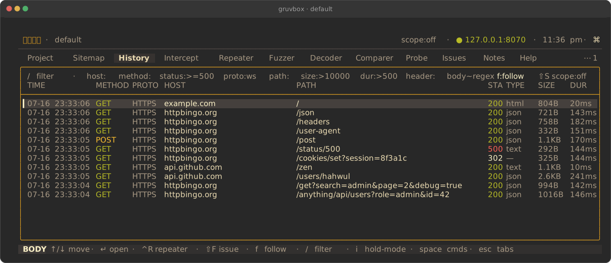
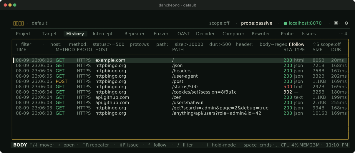
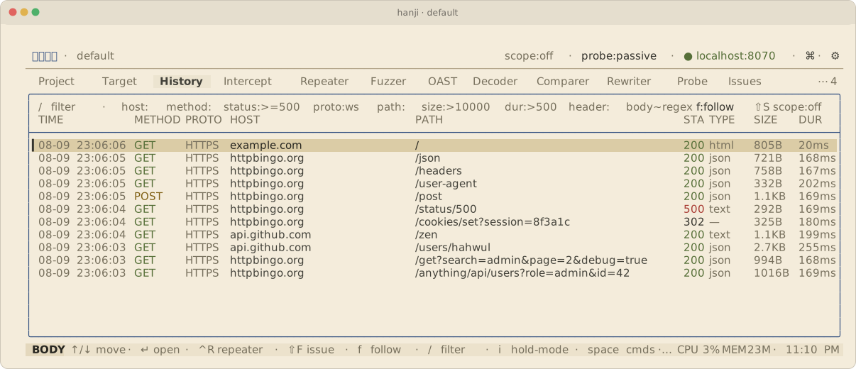
The same History view across six of the built-ins:
Custom Themes
You can add your own themes as JSON files, dropped into:
~/.gori/themes/<name>.json
(~/.gori is the gori home directory; override it with $GORI_HOME.) The file name is the theme name. ocean.json becomes the theme ocean. Custom themes appear in the picker after the built-ins, in file-name order. gori loads them at startup and again each time you open the theme picker, so you can drop a file in and reopen it without restarting.
Format
A theme is a JSON object mapping palette fields to #rrggbb hex colours. Use the optional "base" key to inherit every colour you don't override from a built-in theme, so a theme can be as small as one accent tweak:
{
  "base": "goridark",
  "accent": "#ff33cc",
  "syn_header": "#33ccff"
}
Without "base", the default (goridark) supplies any omitted colour.
A Full Theme
Every field, all inheriting from base when omitted:
{
  "base": "goridark",

  "bg":            "#0a0a0b",
  "panel":         "#141417",
  "elevated":      "#1b1b1f",
  "border":        "#2a2a30",
  "border_focus":  "#3a3a42",
  "focus_gold":    "#d9c28b",
  "accent":        "#fafafa",
  "accent_bg":     "#26262c",
  "selection_dim": "#19191c",
  "text":          "#c8c8cc",
  "text_bright":   "#fafafa",
  "muted":         "#6e6e76",
  "green":         "#52c77a",
  "yellow":        "#d6a13a",
  "red":           "#e5534b",
  "orange":        "#d9813f",
  "syn_header":    "#82a8c4",
  "syn_string":    "#8fb87a",
  "syn_number":    "#ca9b6a",
  "syn_literal":   "#b08ec2",
  "syn_comment":   "#6f8172",
  "syn_keyword":   "#d08c9a"
}
| Field | Used For |
|---|---|
bg |
The canvas (main background) |
panel |
Top bar, status bar, overlays |
elevated |
Header bands, active segments |
border |
Resting hairline dividers |
border_focus |
The outline of an active modal card |
focus_gold |
The focused body pane's outline |
accent |
The highlight colour (selection marker, emphasis) |
accent_bg |
The selection band in the focused pane |
selection_dim |
The selection band in an unfocused pane |
text |
Body text |
text_bright |
Emphasised / active text |
muted |
Secondary / dimmed text |
green |
2xx status |
yellow |
4xx status |
red |
5xx status / errors |
orange |
Accent for warnings |
syn_header |
Header/field names, JSON keys, tag names |
syn_string |
Quoted strings |
syn_number |
Numbers, tag attribute names |
syn_literal |
true / false / null |
syn_comment |
Comments (GraphQL #, JSONC //, HTML <!-- -->) |
syn_keyword |
Language keywords, auth schemes |
Notes
"base"must name a built-in theme. A custom theme can't be the base of another, and an unknown base falls back togoridark.- The file name is normalised to lower-case
a-z 0-9 - _; other characters are dropped (My Theme!.json→mytheme). - A file whose name collides with a built-in (e.g.
goridark.json) is ignored. The built-ins can't be redefined. - Loading is tolerant: an unreadable file, invalid JSON, or a non-object is skipped, and a single malformed colour falls back to the
basevalue rather than discarding the whole theme. A broken theme file never crashes the TUI. - For readability, keep your functional colours (text, status, syntax) well-contrasted against
bg; the built-ins target WCAG AA (≥ 4.5:1).
Next Steps
- Hotkeys: rebind gori's keyboard shortcuts the same way
- Settings: the Preferences modal and every section in it
- Configuration: where
settings.jsonlives and what else it holds